
How we’re building gift packaging that tells a story—and why it matters for our clients.
There’s a reason why people save the Tiffany & Co. box long after the jewelry’s been worn. Or why opening an Oribe shampoo feels like unboxing a luxury candle. Certain brands have mastered the art of packaging not just as a container—but as part of the experience.
Good packaging doesn’t just hold something. It holds meaning.
It’s a handshake, a first impression, and sometimes even a keepsake.
At MWMC Design, we’ve been supporting our client Shoehorn Society in dreaming up their own luxury packaging concepts—and to do that well, we decided to get our hands dirty and run our own mini packaging study.
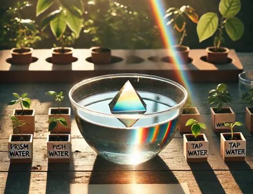
The Object: A Small Prism House
We chose a small, iridescent prism in the shape of a house. It catches the light like a gem and feels symbolic—something about it just says home, clarity, peace, beauty. It’s the kind of object you’d put near a window or on a desk and find yourself quietly admiring.
We’re still deciding what to name it—maybe something like “This House is a Home.” Whatever the name, we’re designing the packaging to reflect what this object feels like: safe, bright, gift-worthy.
What Makes Packaging Feel Special?
In studying brands that get it right, a few things consistently stand out:
-
A strong concept. Tiffany has the blue box. Glossier has the pink pouch. Apple has the satisfying magnetic closure. There’s a core idea behind the packaging.
-
Intentional layering. The moment-to-moment sequence matters: outer box, inner reveal, softness, texture, message. It’s like opening a letter with multiple folds—it slows you down.
-
Material that feels good. Think soft-touch matte boxes, subtle embossing, thick cardstock tags, ribbon pulls, textured tape.
-
A little story or phrase that ties it together. Even a simple tag can say, “This was made for you” without saying it directly.
We’re applying all of this to our Prism House. Here’s where we’re headed:
-
A small matte-finish box that fits perfectly in the hand
-
Light tissue paper inside to cushion the prism, sealed with washi tape
-
A tag with a phrase like “This House is a Home” or “A Place to Land”
-
Possibly a short printed message inside, something poetic but grounded
-
A color palette that feels warm, clean, and soft on the eyes
The goal is to make it feel intentional and emotional—but not overdone.
Why We’re Doing This
For clients like Shoehorn Society—and others dreaming up product lines—packaging is the bridge between concept and customer. It says “this matters” before the product even speaks for itself.
By going through this process ourselves, we’re sharpening our instincts and expanding our toolkit. We’re not just designing packaging—we’re learning how to craft experiences that stick.
And when it comes time to do this for our clients, we’ll be ready—with ideas backed by both vision and hands-on experience.
Stay tuned for photos and our final name reveal for the Prism House soon.


Leave A Comment